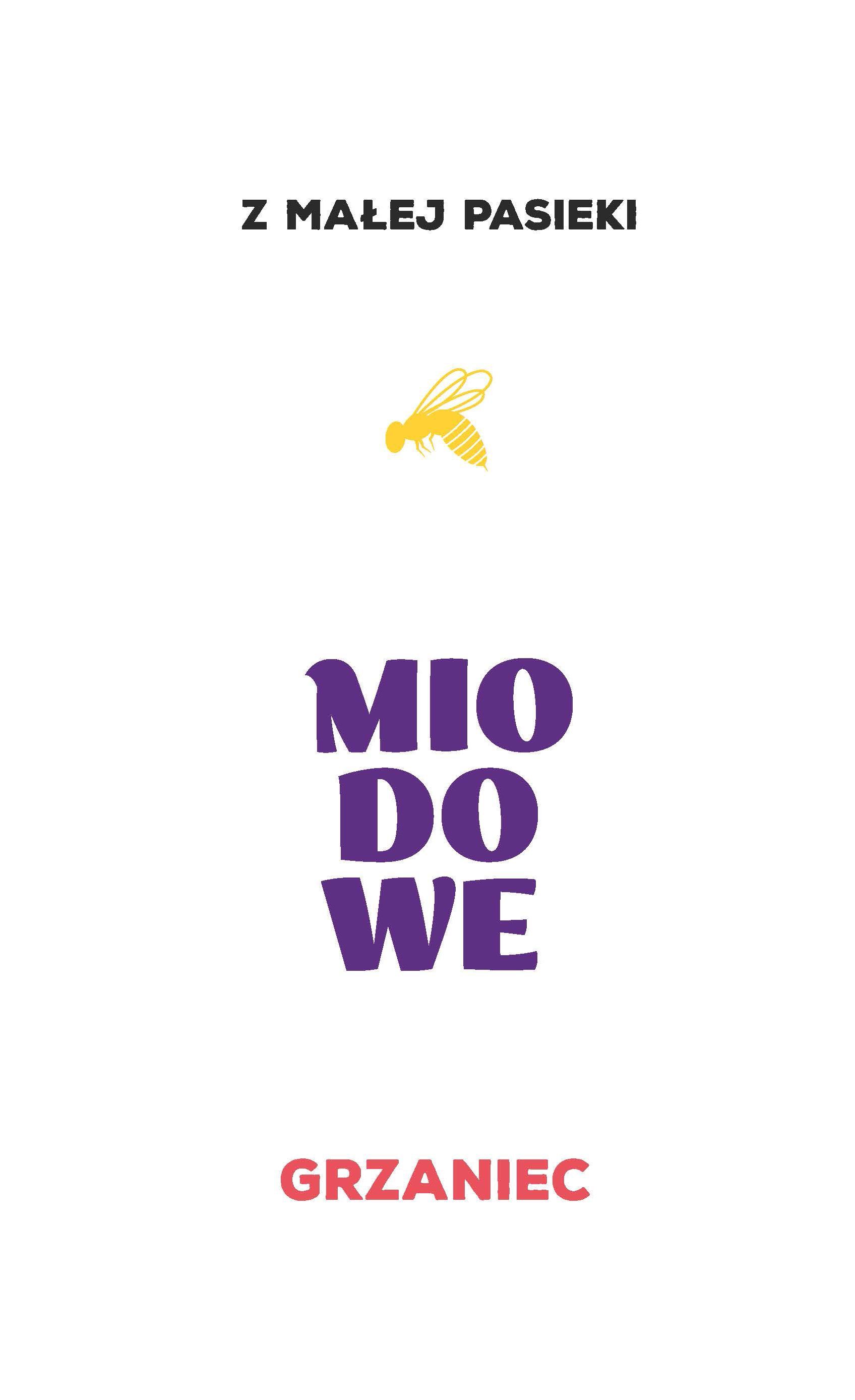
Design of beer labels for two flavor lines, each in three variants, being the basis for the development of the chosen direction in case of emerging new beer varieties.
The process of creation was previously supported by data specified for the line of target groups, age, gender and the perception of the brand and product, as well as guidelines in terms of associations and the expected image to be built by the logotype created for each line, as well as the entire graphic label design along with selected typographic solutions.
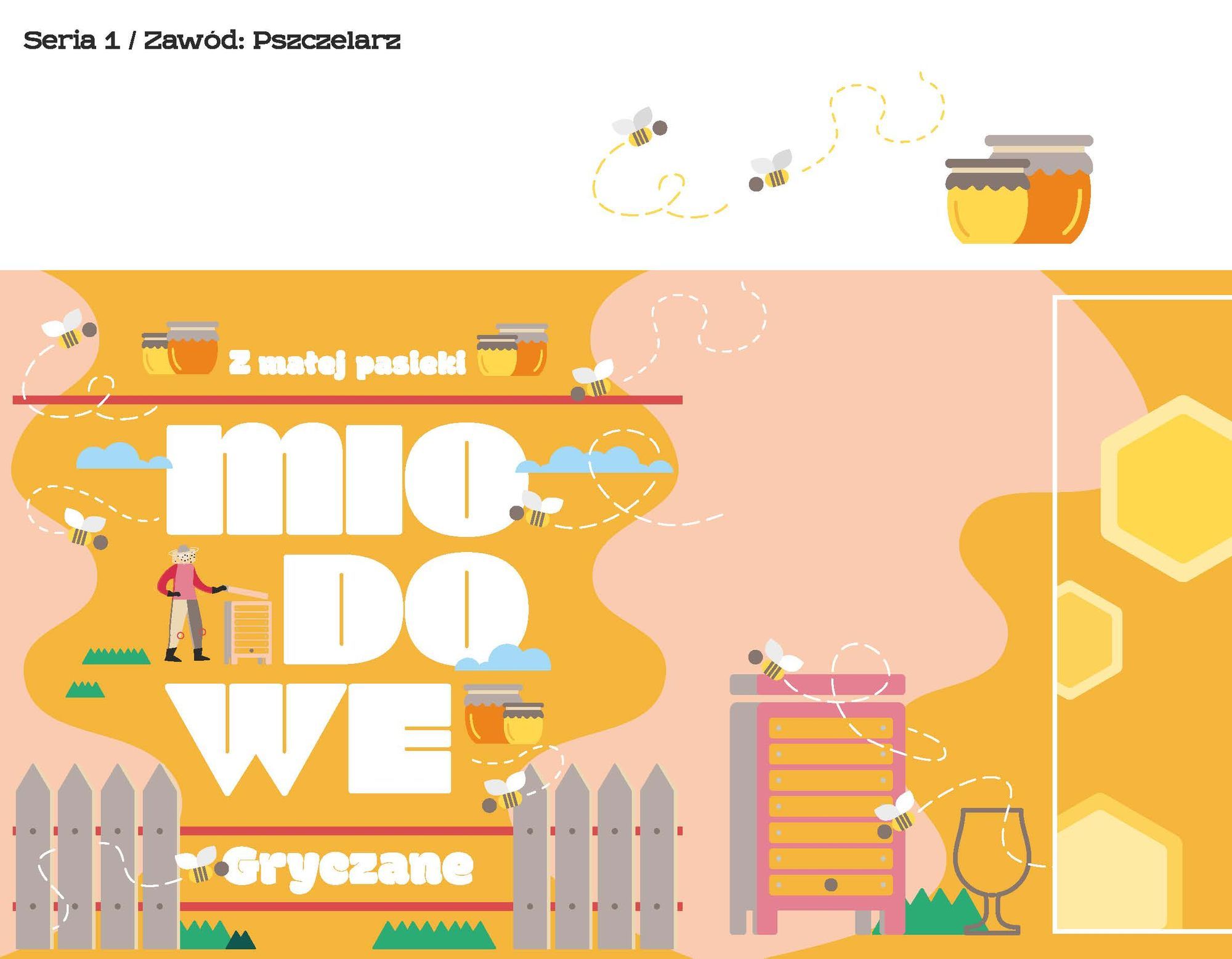
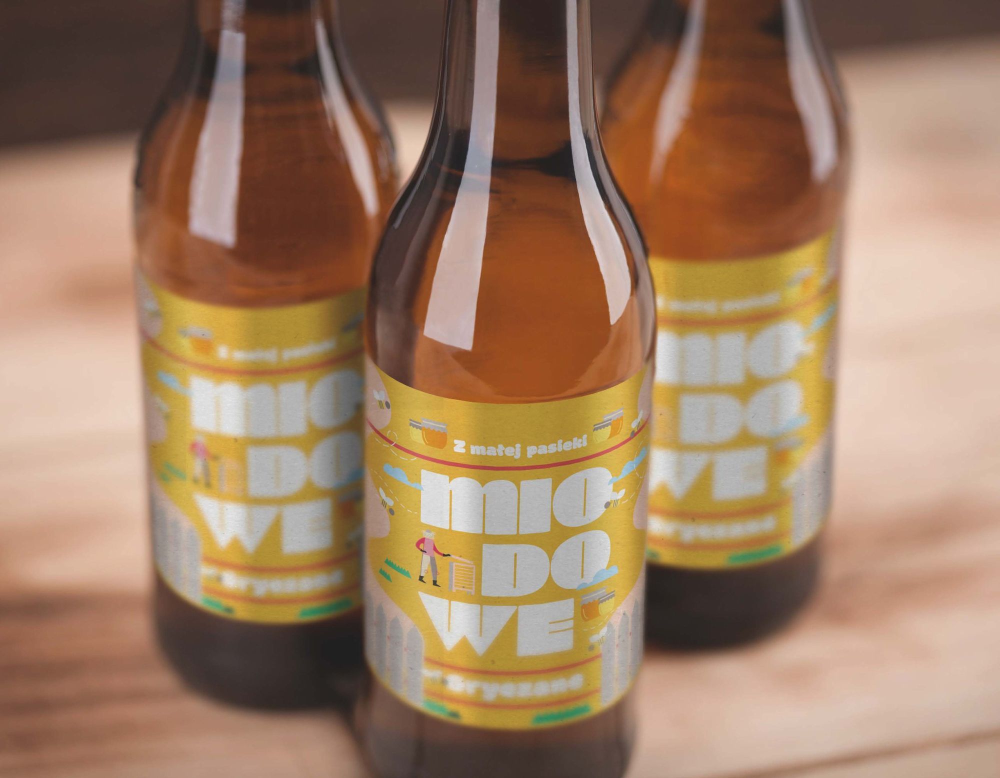
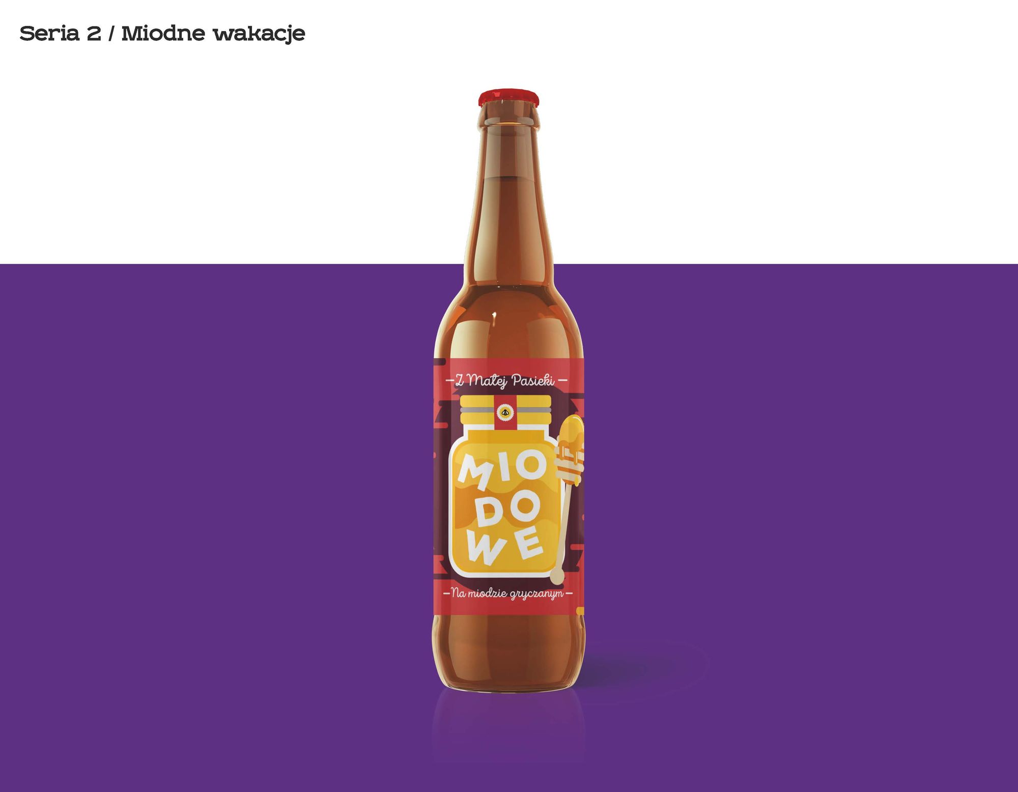
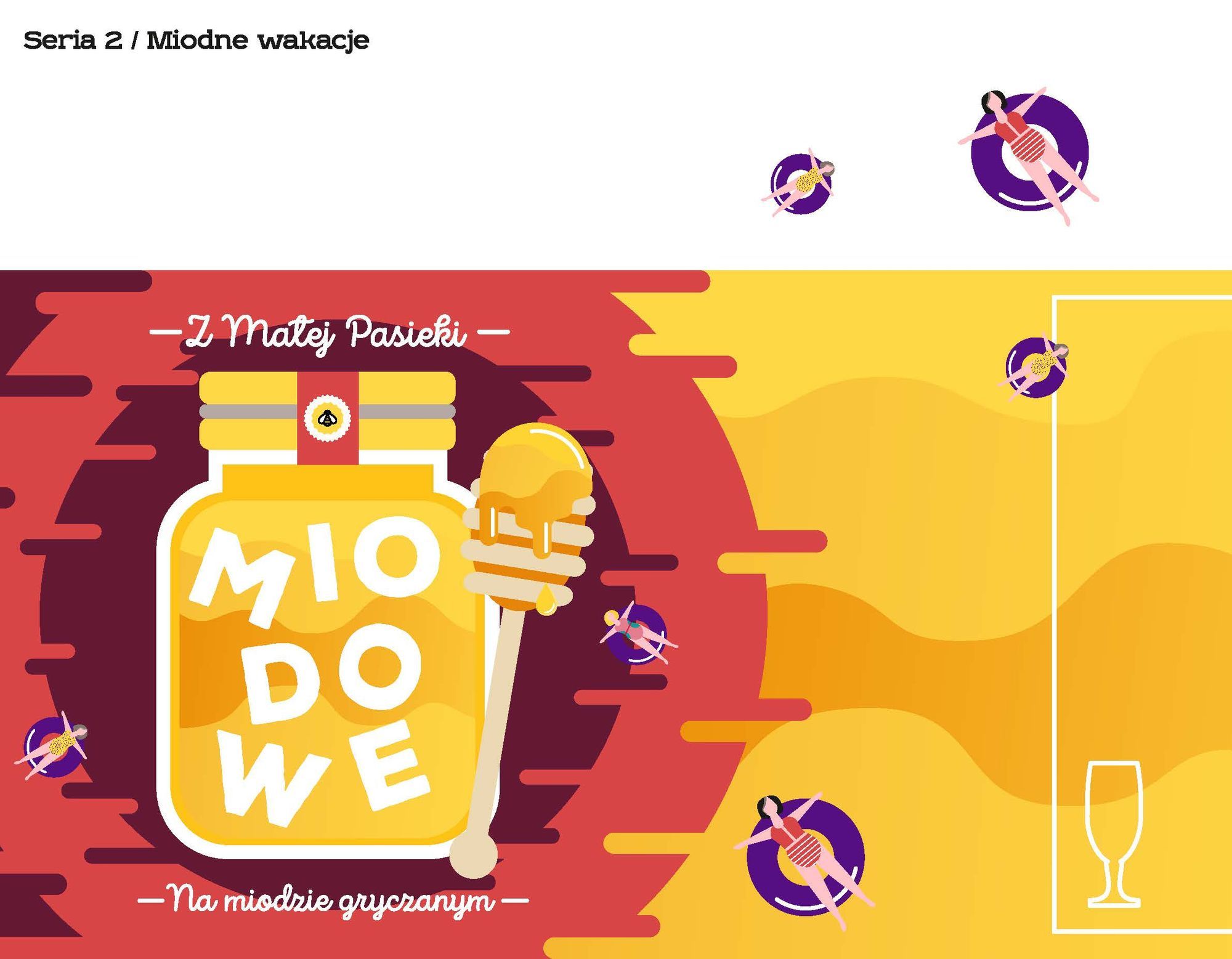
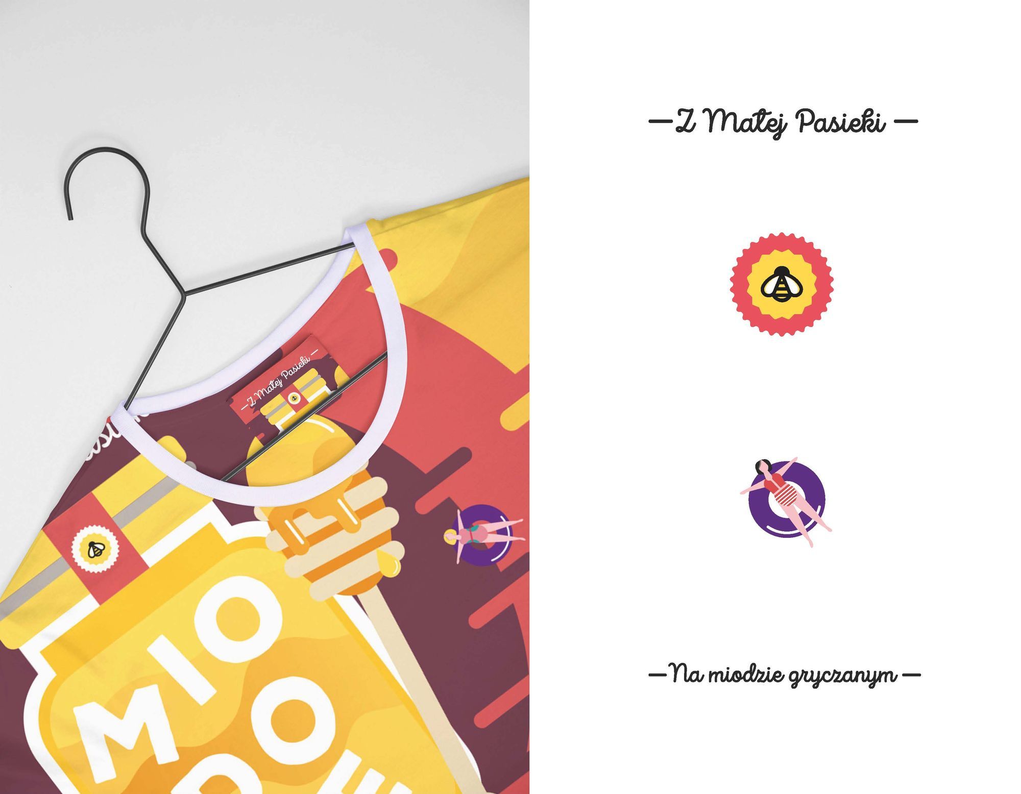
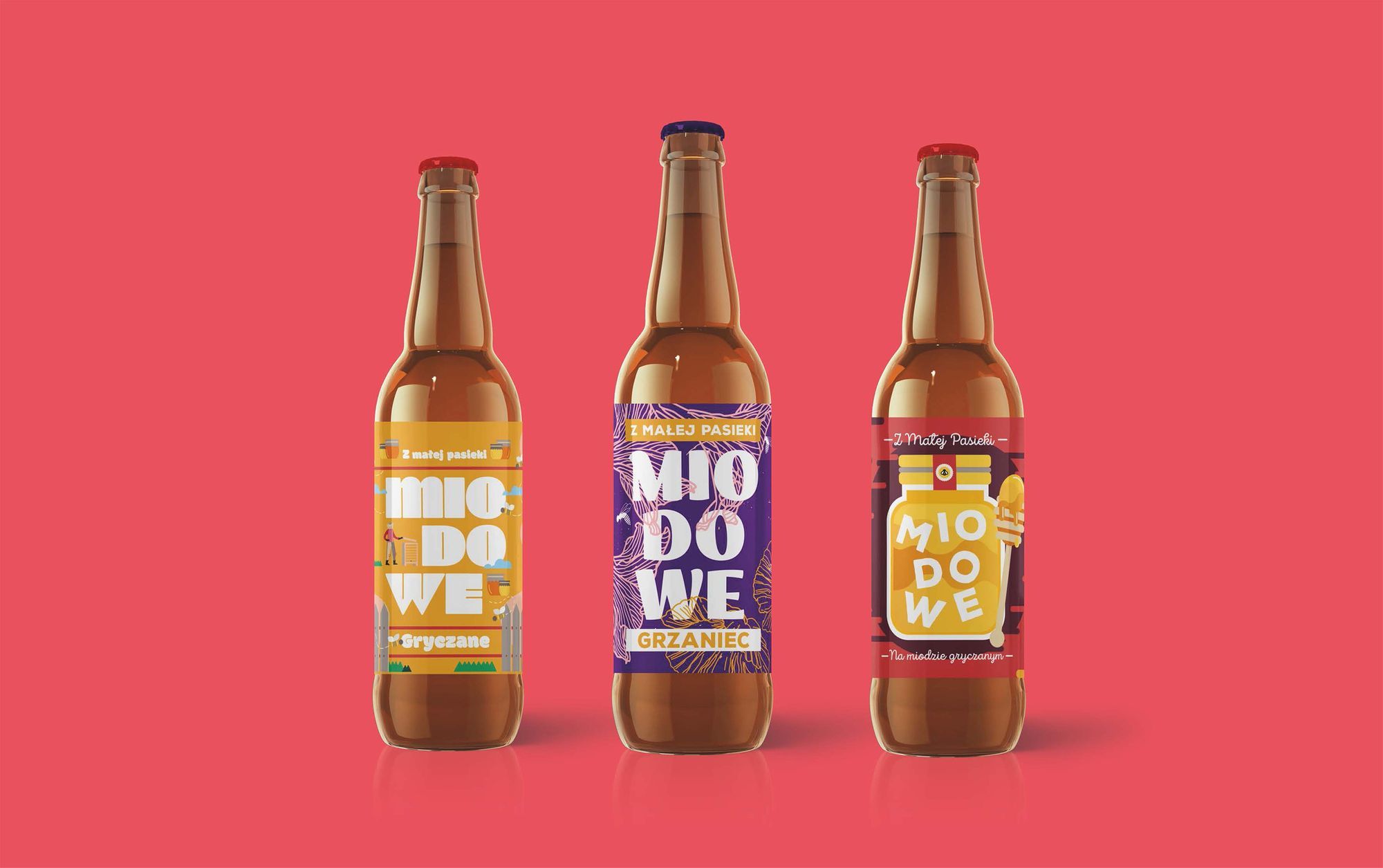
The first line variants focused on the honey flavor of the beer, the natural qualities of the product and living in harmony with nature. Being dedicated to a wide audience, they were supposed to evoke associations with a healthy lifestyle, relaxation in the fresh air, homemade preserves from our grandmothers and grandfathers, and an artisanal approach to the product.
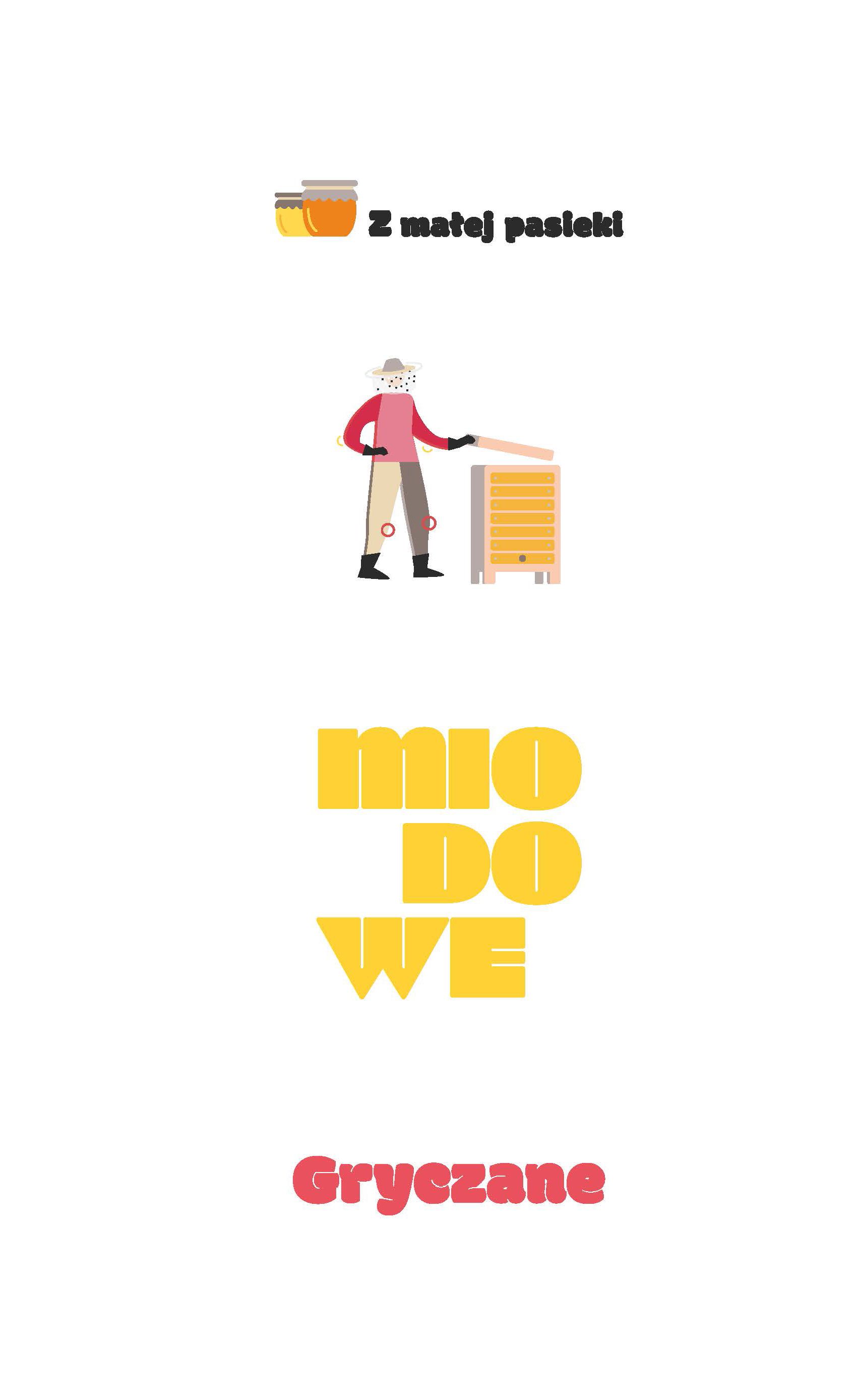
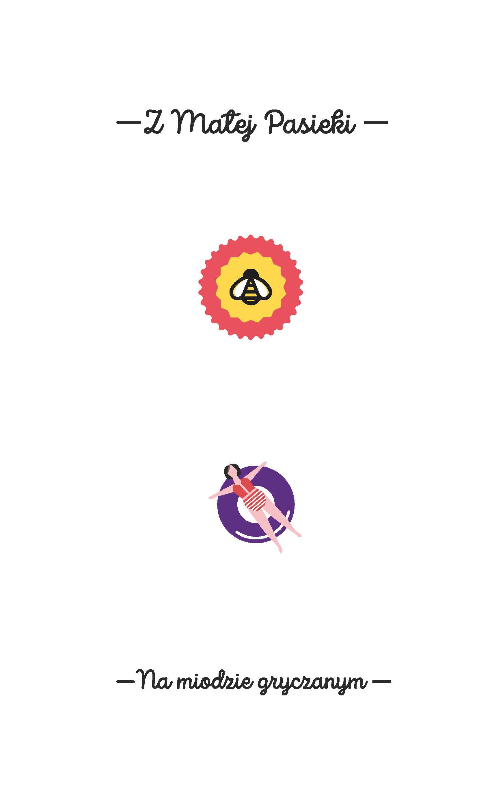
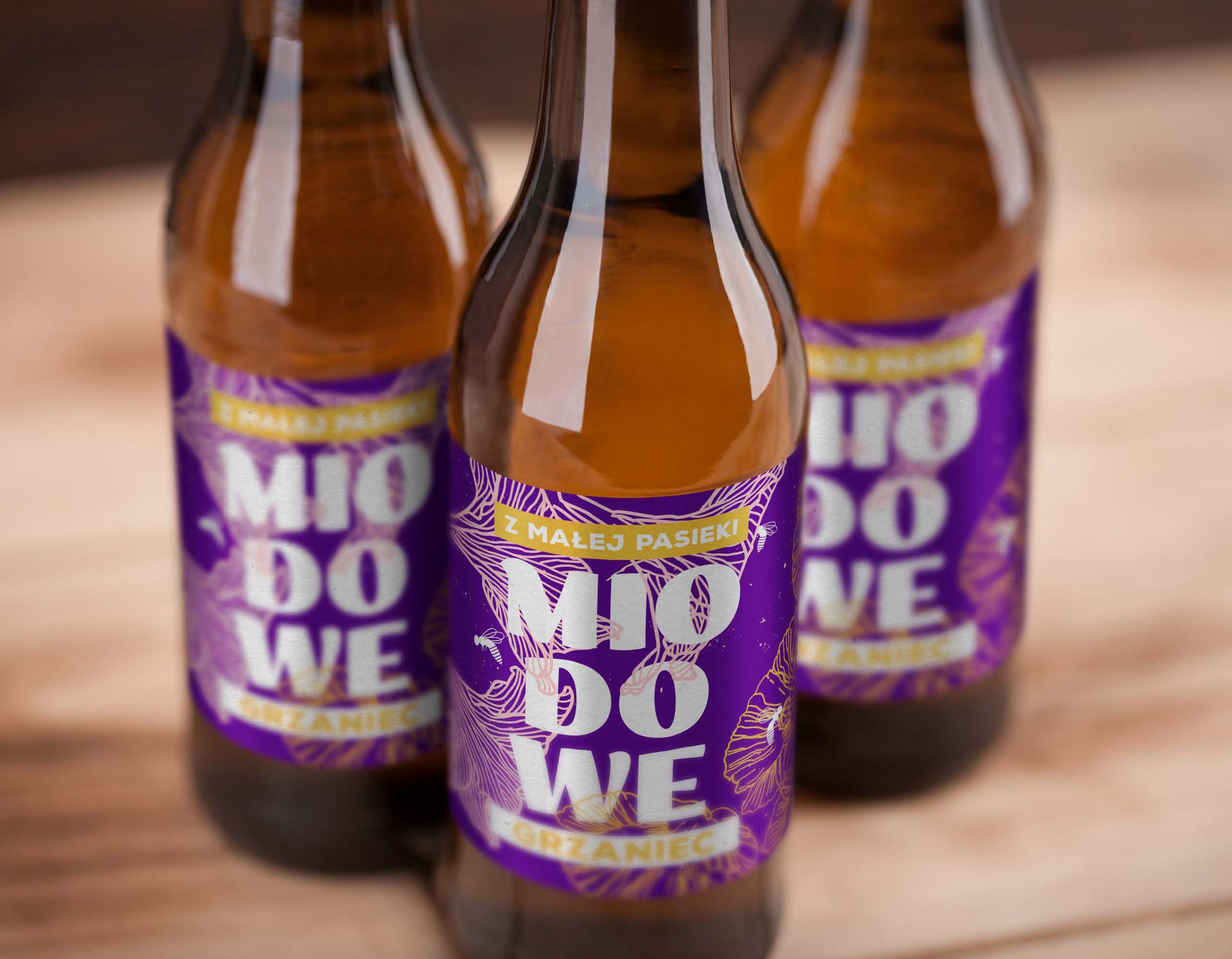
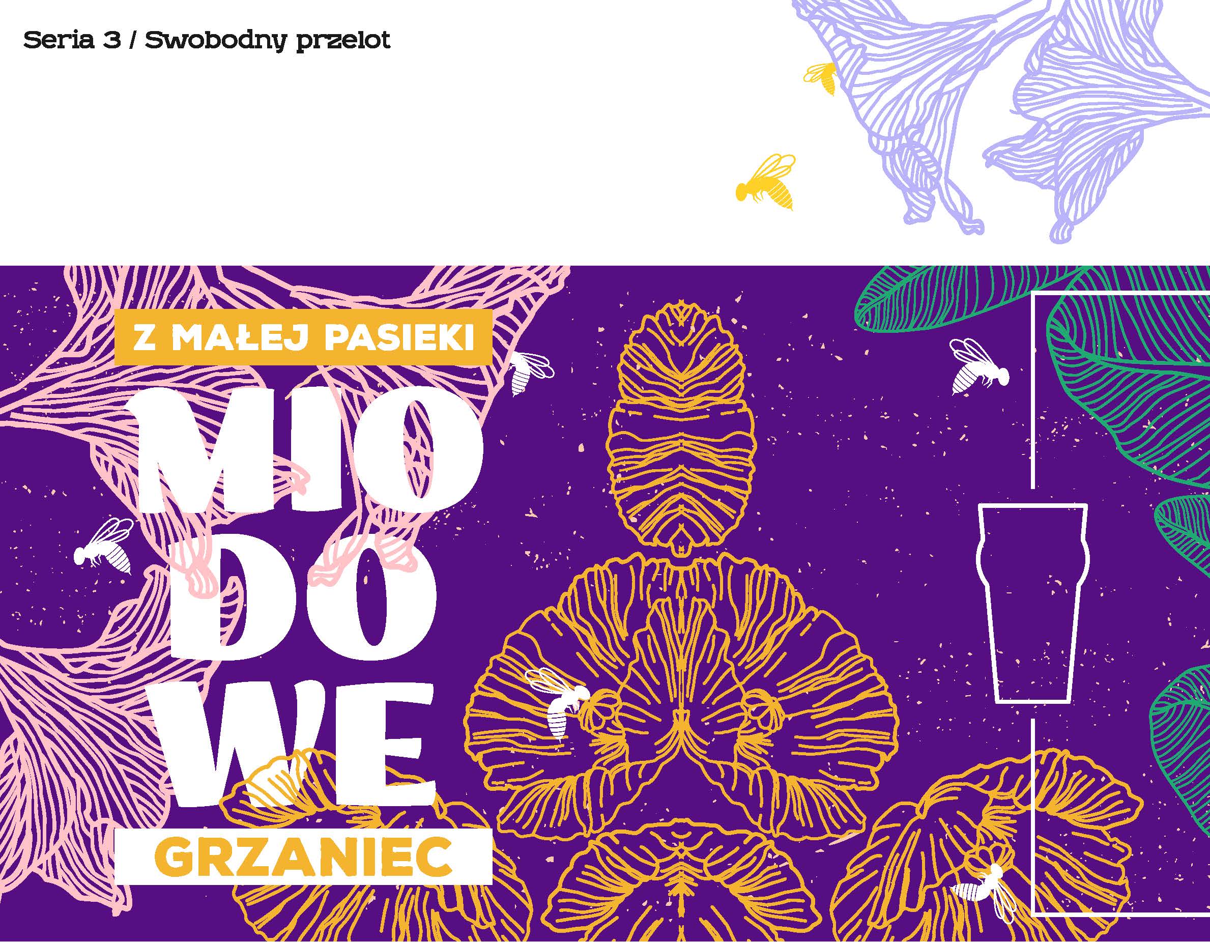
Selected graphic leitmotifs were: a beekeeper, apiary, nature, laziness and a sunny weather, which could be felt in the typography. On the basis of these guidelines, three series of labels were created, which we divided into subgroups focused on selected areas: "Occupation: Beekeeper", "Honey vacation" and "Free flight"
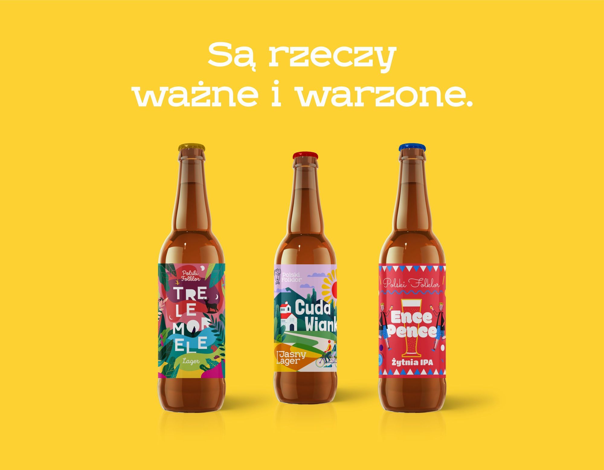
The second line of labels is aimed at a slightly more narrow audience.
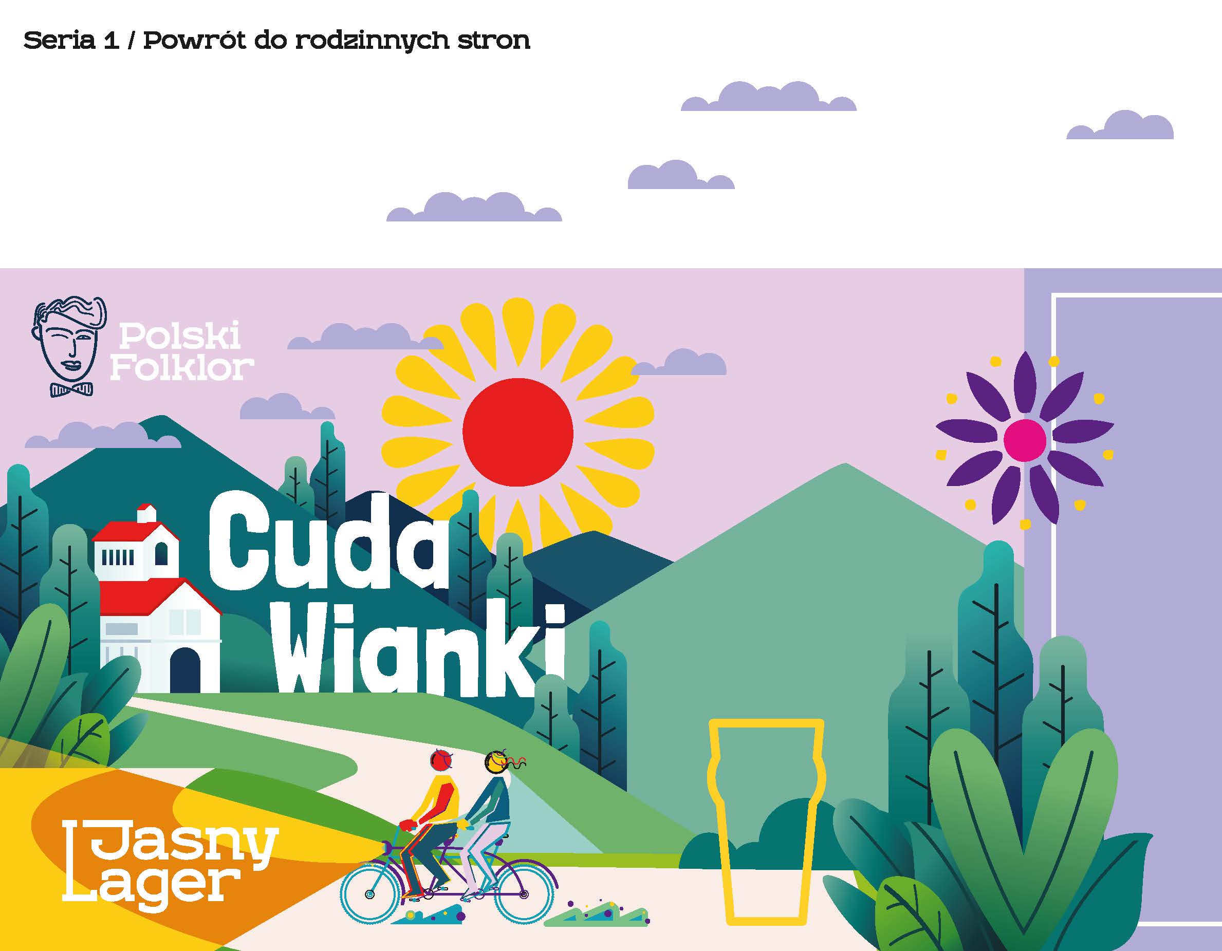
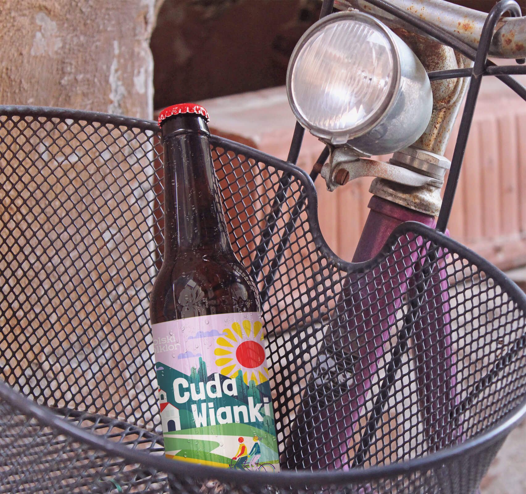
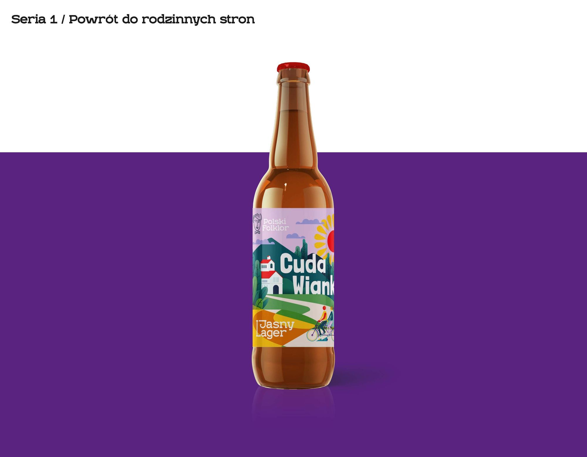
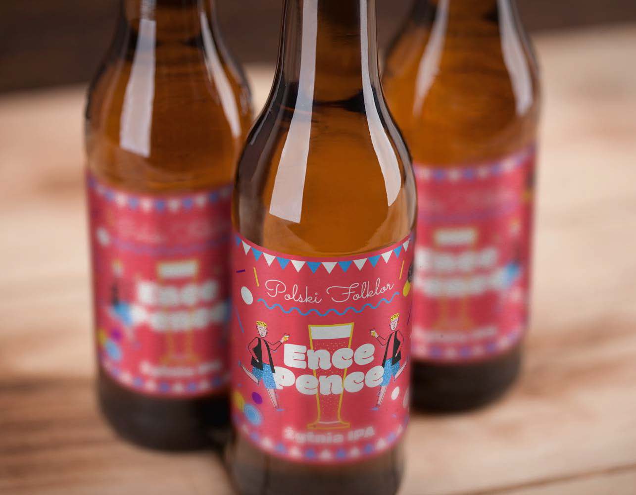
It was targeted at people attached to the folk tradition in a broad spectrum of terms, emphasizing both the historical aspect and, more importantly, attachment to the region, its natural values, local patriotism, a group of friends or a sense of authenticity. The implemented project was also supposed to evoke childhood memories, evoke a desire to return to a calmer life on the outskirts of cities, the atmosphere and color of the dances and the accompanying smile.
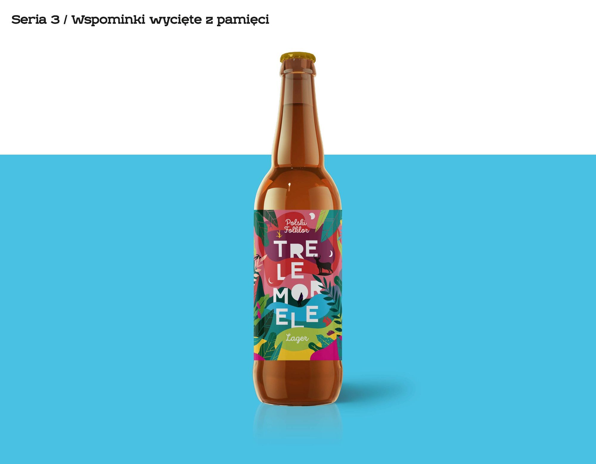
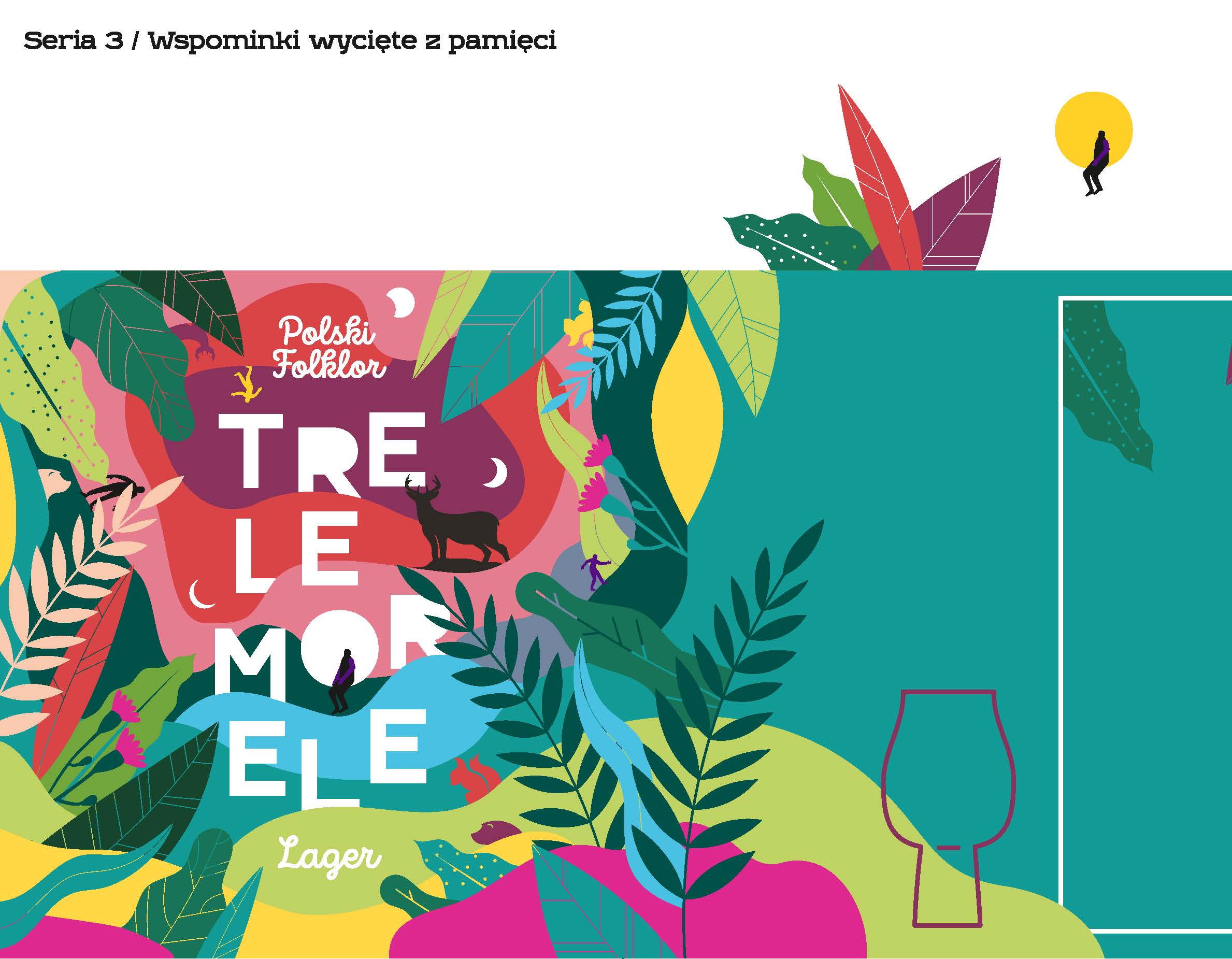
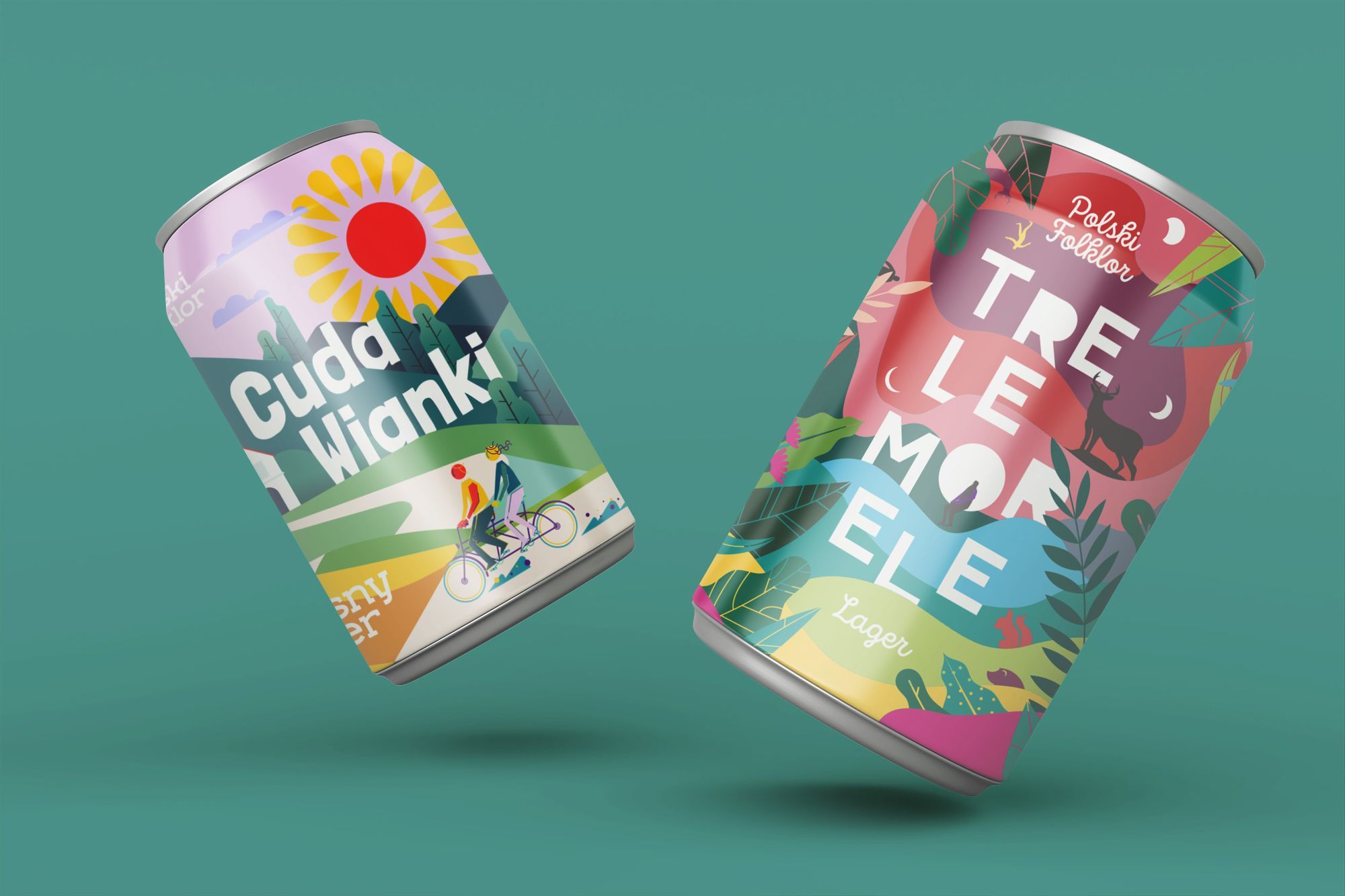
The graphic leitmotifs were folklore, natural landscapes, folk atmosphere, emotions accompanying a meeting with friends or a quiet, idyllic journey. Three ways, that we followed, have been divided into separate paths, assuming that the label base is to be a variant for its subsequent iterations. Naszą uwagę położyliśmy na trzy aspekty, które były możliwe do przedstawiania na różne sposoby: krajobrazy wiejskie, ludzkie interakcje oraz naturę. Wynikiem były serie: "Powrót do rodzinnych stron", "Kto żyw na potańcówkę" i "Wspominki wycięte z pamięci".
We focused our attention on three aspects that could be represented in different ways: rural landscapes, human interactions and nature. The result was the series: "Coming back home", "Everybody for a dance" and "Pieces of memories".